Nutrient status at a glance
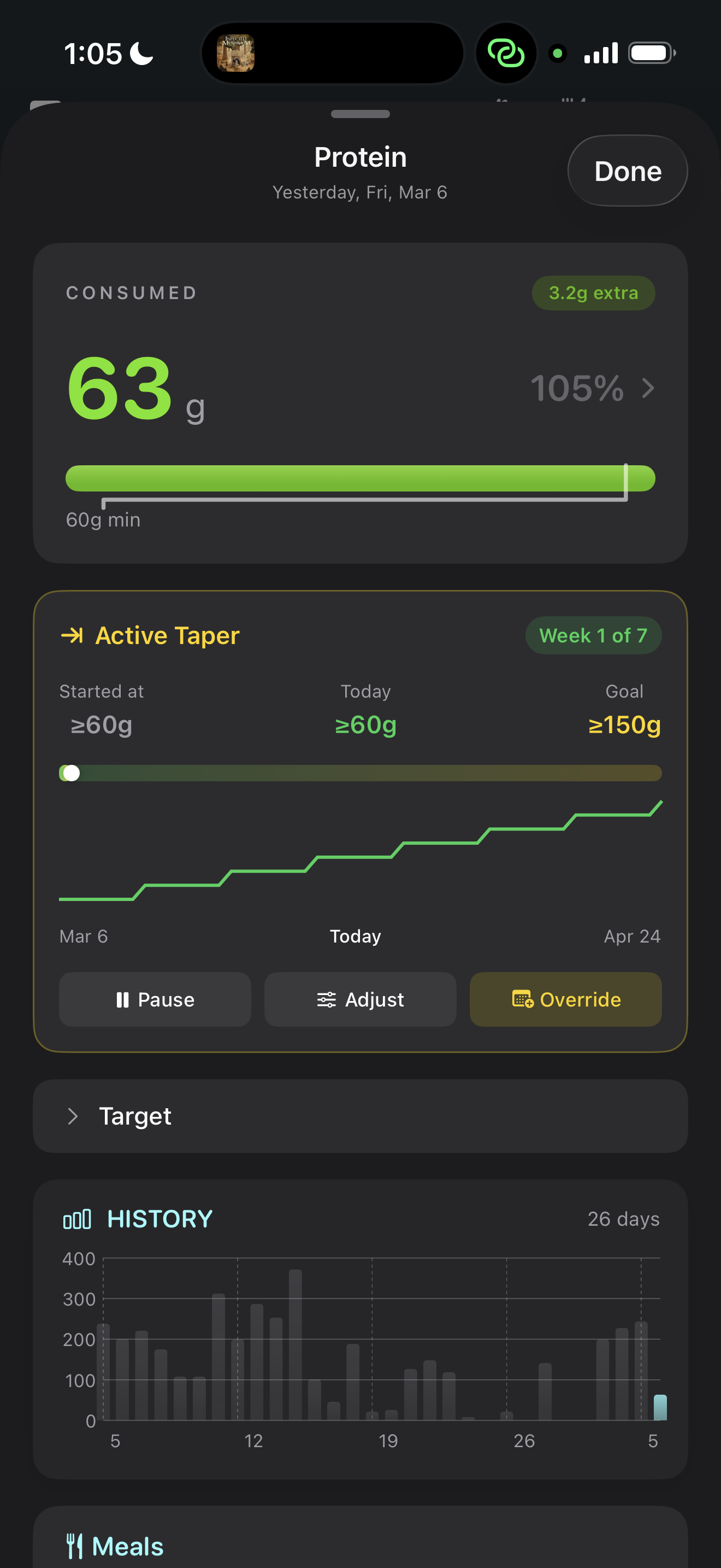
The core of the dashboard is the nutrient status view. For every nutrient you track, you see a single bar showing:
- Your current intake for the day
- Your recommended range (lower and upper bounds)
- Whether you're below, within, or above the range
- If a taper is active, the taper-adjusted target for today
The bars are color-coded: green when you're within range, amber when you're approaching the edges, red when you've exceeded the upper limit. This visual language lets you scan 20+ nutrients in seconds and know exactly where you stand.
Nutrients are organized by category — macros, vitamins, minerals, fatty acids — so you can quickly focus on what matters to you. The dashboard also highlights any nutrients that have been consistently below range over the past week, surfacing patterns you might miss day-to-day.

Meal and food breakdown
Tap any nutrient and NutriKit drills down to show you exactly where your intake came from:
- Meal breakdown — how much each meal (breakfast, lunch, dinner, snacks) contributed to the total. This answers “why is my sodium so high today?” instantly — oh, it was lunch.
- Food breakdown — within each meal, which individual foods drove the numbers. If your protein is high, you can see it was the chicken at lunch and the Greek yogurt at breakfast — not an even spread.
- Percentage contribution — each food shows what percentage of the day's total it represents, so you can identify your biggest dietary drivers at a glance.
This drill-down works for every nutrient, not just macros. Want to know which foods contributed the most vitamin C today? Two taps.
Your complete diary timeline
NutriKit keeps your entire food diary — every day, every meal, every nutrient — and makes it all accessible from the timeline view. Scroll back to any date and see exactly what you ate, how it stacked up against your targets, and how your targets themselves may have changed over time (via tapers or recalculations).
This isn't just a log — it's a longitudinal record of your nutrition. You can spot patterns across weeks and months: Are you consistently under on fiber? Does your protein drop on weekends? Is your sodium trending up since you started eating out more?
The timeline also shows your weight data overlaid with your intake, making it easy to visually correlate dietary changes with body composition trends. This is particularly useful when running the energy balance algorithm — you can see the relationship between what you're eating and how your weight is responding.
Designed for zero friction
The dashboard is built on a principle: the most important information should require zero navigation. When you open NutriKit, you see today's status immediately. No loading screens, no tab switching, no buried menus.
Every interaction follows a progressive disclosure pattern — summary first, detail on demand. The top level shows you where you stand. Tap to see which meals contributed. Tap again to see which foods within that meal. At no point do you need to remember where something is hidden.
The interface adapts to what you care about. Nutrients you track frequently float to the top. Nutrients you've never been out of range on stay collapsed. The dashboard learns your attention patterns and respects them.